
Responsive Redesign for Simon Fraser University
Creating an optimal experience across devices
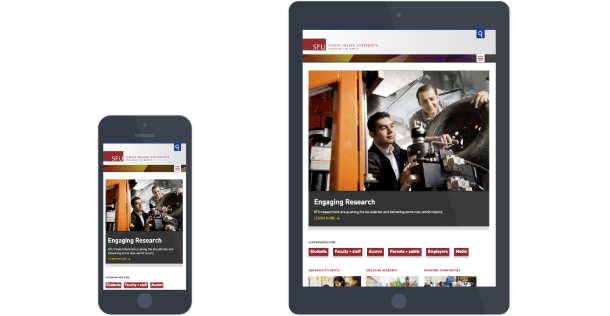
As part of IT Services, my team designed and implemented Simon Fraser University's responsive common look and feel. Our goal was to create a great viewing experience for university content on all devices. The new responsive templates were made available on the university's content management system so any department on the system could quickly converted their site to the new templates.
My role involved a mix of design, front-end development and testing.
Designing the Profile Template
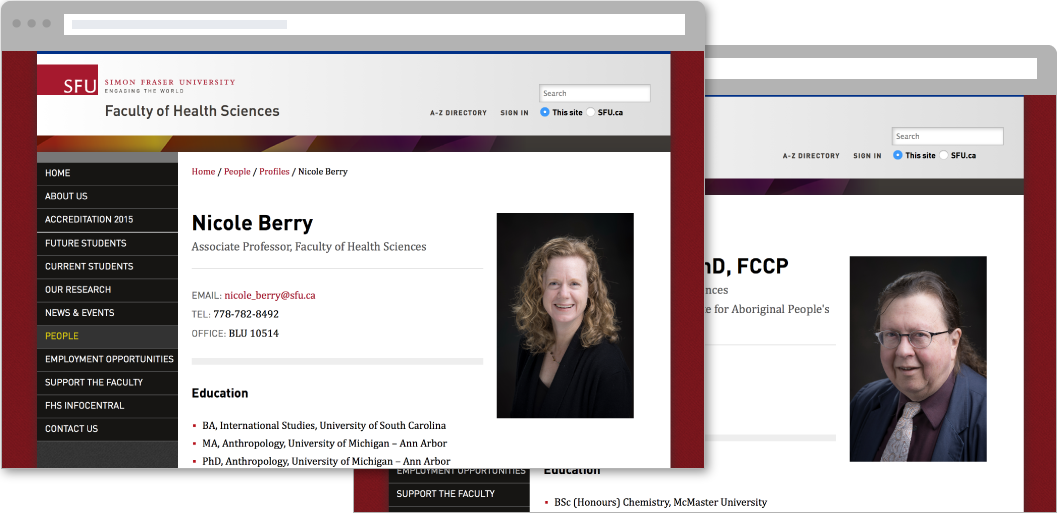
One of my main tasks was to update the faculty profile template. I had originally built it for the previous common look and feel, and now how to update its design. This involved building the template within the CMS, writing custom CSS, and a small amount of JS.
To go with the template, I created a directory list style and wrote documentation for authors interested in using it. The documentation also included a guide for customizing the directory.
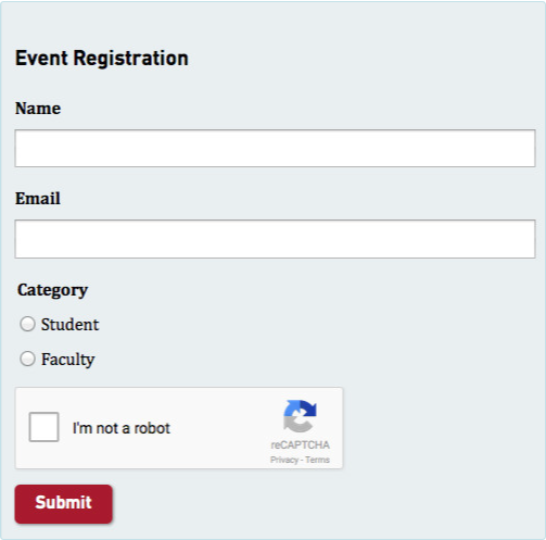
Building Better Form Components
Working closely with a back-end developer, we made a new set of responsive form components. We enhanced the form building experience by making the CMS generate the form component name automatically. With the previous form components, authors had to manually enter a name.
I wrote the HTML and CSS, while my coworker implemented the code into production.
Improving the Small Interactions
As I was testing the search field on the iPad, I noticed the text I entered into the field would disappear when rotating the iPad from landscape to portrait. Looking into it, I discovered the template actually had two search components. One would only show on small screens while the other would only appear on large screens.
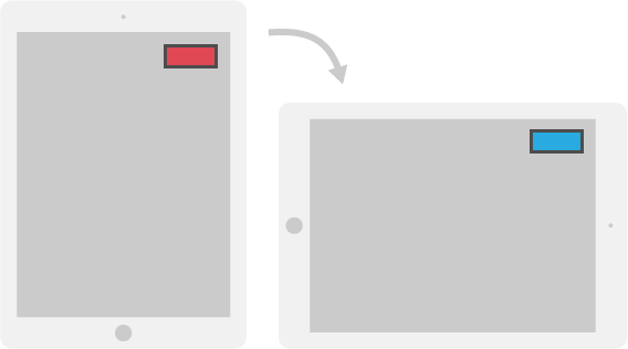
To show the back-end developer how we could have the same design with just one search component, I built a prototype in HTML, CSS, and JS. He then updated the template's HTML and JS in production while I updated the search component's CSS.
The Outcome
The responsive redesign of SFU's main site was launched in July 2013. The templates were made available on the content management system shortly after. As off January 2015, over 150 sites had converted to the new responsive template.